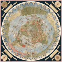
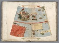
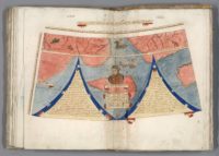
 The largest known early map of the world has been digitally stitched together into one single glorious panorama of exotic far-flung lands and mythical creatures. This virtual parturition births into the world the cartographic baby of Urbano Monte, a 16th century geographer who created the planisphere in 1587. The 60-page manuscript covered depicted all the known world from the North Pole to the much conjecture but still unknown Terra Australis way down south. The 60 manuscript pages when put together to create the complete top-down view of the earth Monte envisioned are 10 feet by 10 feet, the largest early non-mural map known.
 That’s not its only intriguing attribute. It’s a North Polar projection, aka an azimuthal equidistant projection which accurately positions landmasses along global meridians. While there are a few examples of the form before Monte’s planisphere, his use of the North Polar projection in this map was a major step forward and later cartographers borrowed from it liberally. He drew every part of the map by hand on those 60 sheets, labelling every land mass, every hill, every dale, every river, country, ship and coastline, practically every tree. There are charts that record the length of days and nights during the year, the strength of the sun’s rays at different times, a lunar eclipse, a wind chart and many tidy explanations of geographic nomenclature and concepts. It is unreal, and I’m not just saying that because of the mutant fish monsters and mermen living it up in the Terra Austraulis Ignonita, which appears to have basically been Vegas before Bugsy Siegal.
It was this information dense by design. Monte included information on weather, topographic data, the amount of daylight, and tons more because he wanted it to be the complete resource for the learned statesman, a scientific planisphere that was to be secured in a wood panel and revolve above the heads of viewers via a pin through the North Pole, a slowly turning planet, if you will. The revolving map was another innovation of Monte’s.
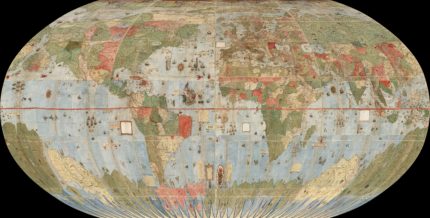
 Unfortunately he never did put the manuscript sheets together and create his great masterpiece. The masterpiece has remained bound in Italian sheep leather for 430 years. (There are two other manuscripts known, one with missing areas, the other a later one of 64 pages.) Making Urbano Monte’s dream come true is now possible without destruction, as long as you have the expertise, resources and dedication to put in the many hours of work takes. The David Rumsey Map Collection at Stanford University recently acquired the manuscript and has been digitizing its pages. They’ve done a spectacular job and the end result is an online resource that allows visitors to zoom in to enormously high resolution images of each page as well as to see a digital composite of the pages in their proper order, assembled just the way Monte instructed on one of the pages of the planisphere. There’s a top-down view of the 10×10 square map, several reprojections that map the virtual map on to the globe, as a Mercator projection, etc. Every label is easily readable thanks to the zoom, resolution and Monte’s elegant, clear-as-a-bell handwriting. It’s a digital masterpiece of an analog masterpiece.
When we georeference Monte’s map and then re-project it into Mercator projection we immediately understand why he used the north polar projection instead of Mercator’s: Monte wanted to show the entire earth as close as possible to a three-dimensional sphere using a two-dimensional surface. His projection does just that, notwithstanding the distortions around the south pole. Those same distortions exist in the Mercator’s world map, and by their outsized prominence on Monte’s map they gave him a vast area to indulge in all the speculations about Antarctica that proliferated in geographical descriptions in the 16th century. While Mercator’s projection became standard in years to come due to its ability to accurately measure distance and bearing, Monte’s polar projection gave a better view of the relationships of the continents and oceans. In the 20th century air age, the polar projection returned as a favored way to show the earth. Monte would have been pleased to see a modern version of his map used in the official emblem of the United Nations.

That is totally cromulent map. Imaging making something even remotely that accurate with colored pencils and 60 sheets of paper (well, sheepskin). You must browse through every page of this map and zoom way in to the spot all the animals, monarchs on thrones, irate mermen, even the aritst himself in not one, but two self-portraits. It’s too good not to be enjoyed in all its glory. Then you can pay homage to the master by seeing it look incredible connected as he had intended it to be 430 years ago. It’s been a long time in coming.