Take a 3D tour through Rothwell charnel chapel

Rothwell charnel chapel is the UK’s most complete surviving medieval charnel house, rooms used to contain the bones of the dead to make room in cemeteries for the next generation of corpses. The charnel chapels attached to churches in the Middle Ages weren’t scary places. They were well-lit, clean, sturdily built with permanent access from the exterior (doors, stairways) so the general public could visit and pay their respects to the dead. Rothwell Parish Church built its charnel room under the church and contains the remains of at least hundreds of people who died in the Middle Ages.

It’s difficult to know how many charnel chapels existed in medieval Britain. Historians have generally thought they were fairly rare compared to their frequency on the continent, but researchers from the University of Sheffield think they have located as many as 60, or at least what little is left of them Time and the destruction wrought by the Reformation took an incalculable toll. That’s why Rothwell’s is so significant. One of only two medieval charnel chapels still remaining in situ (the other is St Leonard’s in Hythe, Kent), it is largely intact and still contains human skeletal remains placed there between the 13th and 16th centuries.

Dr Lizzy Craig-Atkins, who led the project from the University of Sheffield’s Department of Archaeology, said: “Rothwell charnel chapel is a site of major international significance. Surviving charnel chapels, with human remains still housed inside, are very rare in England. What is so fascinating about the Rothwell charnel chapel it is that it presents an ideal archaeological resource for researchers to use to advance our understanding of how the remains of the dead were treated during the medieval period.

With so little hard data to go on, many historians thought charnel houses were of minor religious import even in their heyday in England, that they were just places to store bones dug up from the intercutting of new graves or during church construction. The University of Sheffield’s Rothwell Project has upended that belief. It wasn’t until the 13th century that charnel houses and chapels began to be constructed. Before that, dug up bones were reinterred in the new grave or in mass pits. The new charnel spaces of the 13th century were the first time human skeletal remains were kept above ground in meaningful quantities. That’s a major shift in attitude and approach, and it can’t be explained in utilitarian terms because reburying the bones is a lot easier, cheaper and faster than building an above-ground space for them.

Rothwell Project researchers think this shift is connected to the doctrine of Purgatory receiving official Church recognition in 1254. Souls suffering the torments of purgation could be sped on their way to heaven by the prayers and hymns of the living on their behalf. Charnel chapels in mainland Europe are known to have had confessionals and been treated as places or repentance and forgiveness. English charnel chapels also had priests whose duty it was to hear confessions and offer absolution. The Sheffield team thinks all this is linked together, that charnel chapels, like chantries in the churches above them, provided the public with the opportunity to pray for the souls of the departed still locked in purgatory and to avoid the same fate themselves. The rejection of purgatory and confession by Protestants explains why the charnel chapels and their human remains were so cruelly disposed of during the Reformation. The bones were reburied, often in unconsecrated ground, and the rooms either walled up so no trace of them was visible from the outside or reused for random purposes rented out to local merchants for cool storage.

Unfortunately Rothwell charnel chapel is not widely accessible as an archaeological resource, no matter how valuable it might be, because it can’t accommodate human traffic (not of the living kind, anyway) due its delicate preservation conditions. The space is tight, keeping moisture and temperature steady is a challenge, and one false move could irreparably damage the structure and human remains.

In this day and age, there are other options. The Digital Ossuary is a collaboration between the University’s archaeology and computer science departments which has captured the physical space of the charnel chapel, its proportions, where the medieval access points were, high-resolution detail of the bones which will allow osteological study that was previously impossible as well as help determine conservation practices for the long-term preservation of the charnel.

“This new digital resource provides an opportunity for people all over the world to explore the site and helps us to preserve this fascinating window into the past for future generations.” […]

The new digital resource, together with research on the chapel, will be fed into undergraduate and postgraduate programmes for archaeology students at the University of Sheffield.

Archaeologists leading the project are also welcoming the input of researchers who might be interested in working with the model, which has been published via ORDA, the University’s file sharing platform.

And now, without further ado, here is the 3D flythrough of Rothwell Parish Church’s charnel chapel.
Van Gogh’s Sunflowers reunited online in live relay

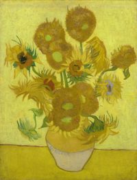
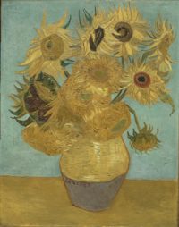
Vincent Van Gogh painted five of his most famous works, the Sunflower series, from August 1888 to January 1889 when he was living in Arles in the South of France. Each of the paintings depict a bouquet of sunflowers in a vase using three shades of yellow (there’s blue in the backgrounds and in some accents). This was a deliberate choice by the artist, his attempt to convey the vibrancy and variety of the flower with the color most characteristic of it. He also used thick, layered brushstrokes, a bold impasto that captured the dimension of the sunflower head and seeds as well as their color.

Van Gogh had explored sunflowers before. When he lived in Paris with his brother Theo in 1887, he painted a series of still lifes of sunflowers, two to four cut blooms withering on the floor. They were very different in palette and mood to the bright bouquets of the Arles works. In a letter from August of 1888, Vincent wrote to his brother that he’d returned to the subject with a new approach:

“I am hard at it, painting with the enthusiasm of a Marseillais eating bouillabaisse, which won’t surprise you when it’s a question of painting large sunflowers. […]

Next door to your shop, in the restaurant, as you know, there’s such a beautiful decoration of flowers there; I still remember the big sunflower in the window. Well, if I carry out this plan there’ll be a dozen or so panels. The whole thing will therefore be a symphony in blue and yellow. I work on it all these mornings, from sunrise. Because the flowers wilt quickly and it’s a matter of doing the whole thing in one go”

The new series of sunflowers was meant to be as welcoming and warm as the one he fondly recalled from the shop next door. Van Gogh was expecting a guest in a few months, his friend and fellow painter Paul Gauguin. He had an idea that they might live and work together sharing a studio, a studio that would be decorated entirely with sunflowers, hence his plan for a dozen paintings in the series. He never got that far, nor did the two artists get a studio together, but Gaugin did come to visit him in the aptly named Yellow House at Arles, and Van Gogh hung two of the sunflower paintings on the walls of his room.

Sunflowers by Vincent Van Gogh, 1888-9. The Mr. and Mrs. Carroll S. Tyson, Jr., Collection, 1963. Photo courtesy the Philadelphia Musuem of Art.Paul loved them so much he point-blank asked Van Gogh if he could keep one. Vincent wanted to make his friend happy — they had fought during Gaugin’s stay and he left earlier than planned on a rancorous note — but he was so desperately strapped for cash and so concerned that Theo, who was engaged to be married, have some money to make a home for his new bride, that Paul’s request put him in an awkward position. He wrote to Theo that he would let Gaugin have one of the sunflowers and redo it so Theo could exhibit it and perhaps sell it.

You’ll see that these canvases will catch the eye. But I’d advise you to keep them for yourself, for the privacy of your wife and yourself.

It’s a type of painting that changes its aspect a little, which grows in richness the more you look at it. Besides, you know that Gauguin likes them extraordinarily. He said to me about them, among other things:

“that — … that’s… the flower.”

You know that Jeannin has the peony, Quost has the hollyhock, but I have the sunflower, in a way.

He didn’t know how right he was. His Arles Sunflowers are now in top museums on three continents: The National Gallery, London, the Van Gogh Museum in Amsterdam, the Neue Pinakothek in Munich, the Philadelphia Museum of Art and the Seiji Togo Memorial Museum of Art in Tokyo. The five will be reunited for the first time in virtual space on August 14th in a Facebook Live event. Curators from each museum will speak for 15 minutes about the paintings in a globe-trotting relay dedicated to Van Gogh’s iconic Sunflowers.

This video from the National Gallery gives a brief introduction to the paintings and the #SunflowersLive event:

The Van Gogh Museum, meanwhile, has created a virtual tour of the Sunflowers so you can explore them at your leisure accompanied by Willem van Gogh, great-grandson of Theo van Gogh. They’re also the only one of the museums to have a fully zoomable high resolution image of their Sunflowers painting on their website (see the link above). You can get way, way up in the details of the work, and you can’t put a price on that especially with an artist like Van Gogh whose brushstrokes are so meaningful.

Unravelling the mystery of the Chimney Map

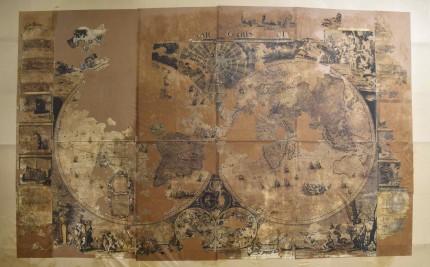
When the National Library of Scotland acquired the balled up bundle of rags that turned out to be an extremely rare example of a 17th century world map by Dutch cartographer Gerald Valck, their first priority was rescuing what was left of it. It was in terrible condition, with large sections decayed beyond recovery and some of the surviving sections reduced to a shower of confetti on the table. Paper conservator Claire Thomson wasn’t even sure the map could be saved.

It took six months, but the conservation team accomplished the impossible, removed the canvas backing, cleaned the paper and put the cartographic Humpty Dumpty back together again. The restored map went on public display for the first time at the National Library in Edinburgh earlier this year. Due to its fragile condition, it was only exhibited for a month (March 13-April 16).

“Maps were largely symbols of power at this time,” said Paula Williams, map curator at the National Library. “They were very expensive to make and even more expensive, relatively, for people to buy. Whoever owned this map wanted to display their own power.”

As the map is Dutch, it represents a world view as seen from Amsterdam, complete with colonial ambitions. Australia, for example, appears as New Holland and the rivalry with their old enemy Spain is represented by a depiction of atrocities committed by Spanish invaders in South America.

Dr Esther Mijers, a lecturer in history at the University of Edinburgh said: “This map throws up more questions than it can answer. It would be wonderful if people wanted to do more research on the map and its story.”

Thankfully, a lot of people do. With the map, of just three known in the world, salvaged, researching its mysterious origin took on new prominence. When the map was first given to the National Library, it was believed to have been stuffed up the chimney of a house in Aberdeen. The story was it was discovered during the renovation of the house, rescued from the trash and delivered to the library.

It promptly became known as the Chimney Map because of its purported discovery spot, but that now appears to be a misconception. It seems to have been found under a floorboard during renovations in the 1980s. The house was formerly part of the Castle Fraser estate and since the castle is now owned by the National Trust for Scotland, their researchers are in full Nancy Drew mode hoping to discover more about the history of this exceptional map and how it wound up in that house outside of Aberdeen.

The National Library is on the investigation too, and they got a hot lead thanks to their YouTube video of the conservation of the Chimney Map. Les Yule, the original finder of the map 15 years ago, and Aberdeen schoolteacher Brian Crossan, the person who gave it to the National Library in 2016, got in touch with NLS researchers. Because they’re awesome and they show their work to public in the most thorough way possible, National Library of Scotland staff starting filming Les and Brian as they look for the house, its owner and find spot. Their first meeting with conservator Claire Thomson was captured on video, as was their collaboration in sniffing out the real history of this remarkable map whose checkered, obscure past has fired the imagination of so many.

That video has now been uploaded to YouTube and it’s worth every minute of the 14:45 running time.

Edward Hopper in Motion

It’s the 50th anniversary of Edward Hopper’s death today. To celebrate the realist painter’s oeuvre, Orbitz (yes, the discount travel site) has created animated versions of nine of his most recognizable and iconic works.

I generally enjoy attempts to add dimension to stills or artworks, for instance the recent trend in documentaries to give a 3D effect to old photographs. A subtle animated element can be effective as long as it makes sense in the context of the scene and it isn’t just distracting. All in all, I find the Hopper animations fairly good. There are some things I’d do differently, mainly fewer short repetitive loops and more smooth continuous action. Some elements — smoke over coffee cups, flickering neon signs — look too rushed. However, Hopper’s characteristic urban scenes often depicted through a window with us as the voyeurs lend themselves well to this sort of treatment. With a few adjustments, it would make a damn cool Tumblr.

Morning Sun and New York Movie are probably my favorites. The slow brightening of the scene in the former brings the title into the action, and the moving picture actually moving is nicely handled in the latter. The flicker in the theater is a bit overdone, in my opinion, with too strong a contrast of light and dark. It doesn’t match what’s being shown on the screen.

I was most looking forward to Nighthawks, but alas, it’s my least favorite of the animations. The blinking light is on too short of a loop and it doesn’t really match the scene because it’s the interior lighting of the diner that flickers instead of a neon sign like Chop Suey. Neon signs flicker all the time. The blinking neon light has become an iconic representation of night life — a little rundown, a little busted, but still vital in its color and brightness. If all the lights in a diner kept turning off and on, you’d just call the power company, and you certainly wouldn’t settle in for the night to enjoy the splendid urban isolation because it would be freaking torture.

The descriptive blurbs on the side are well done. My one criticism there is that they should link to the original paintings instead of just telling you which museums they’re in now.


Mode Persuasive Cartography collection digitized

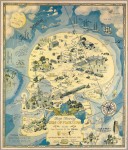
Map Showing Isle of Pleasure by H.J. Lawrence, 1931. Satire of Prohibition shortly before its repeal. Image courtesy the PJ Mode Collection.Persuasive cartography is decidedly more the former than the latter. Its aim is to sell a product or influence opinion using the aesthetic allure and/or the impression of scientific rigor conveyed by maps. The actual science of mapmaking — accurate renditions of land masses, roads, structures, topographical features — isn’t the point, except insofar as it lends the cachet of objectivity to a pitch.

Retired lawyer PJ Mode began collecting maps after seeing an exhibition of old and unusual maps at the Centre Pompidou in Paris in 1980. Over the years he began to narrow his focus to maps of the persuasive persuasion, fascinated by the reasoning behind them. With the advent of the Internet, finding new cartographical gems and researching their background has become increasingly accessible. Today PJ Mode has more than 800 persuasive maps in his collection.

Last month, more than 500 of them were digitized by the Cornell University Library. Now there are 862 of them. They can be browsed by subject or date, you can just load the whole shebang and go through them front to back, or you can limit by date, date range, creator or subject from there. I’m partial to the subject divisions which convey a real sense of how far-reaching this medium was. Almost 200 of the maps are in the Advertising & Promotion category, and they are some of the most aesthetically interesting. The Niagara Belt Line uses one of the most spectacular views in the world to promote its electric trolley line.

The Niagara Belt Line by Hiram Harold Green, 1917. Image courtesy the PJ Mode Collection.

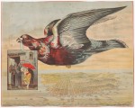
Birds-Eye View of San Francisco by Peruvian Bitters, 1880. Image courtesy the PJ Mode Collection.A good image can sell even the worst product, as any advertiser knows. Patent medicines, most of which were useless at best, active poisons at worst, needed all the colorful artwork they could get: see Peruvian Bitters, for example, which used a literal bird carrying an ad for the product over a bird’s-eye view of San Francisco to flog its bogus cure for malaria, dyspepsia, addiction and unhappiness.

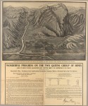
Two Queens Mines by Raymond T May, 1907. Image courtesy the PJ Mode Collection.Even the plain ones without fancy graphics are intriguing because the dry presentation is often used to legitimize an extremely questionable proposition, like the Northern Pacific Railroad Gold Bonds or the Two Queens Mines in Australia, which was a straight-up scam.

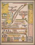
The greatest number of maps, 349, are in the pictorial subject which covers an extraordinary amount of ground from military to political to moral advocacy. There’s even an edition of a map very similar to one I own in giant foldout poster form: a timeline of world history from a Genealogical Chronological & Geographical Chart by Jacob Skeen, 1887. Image courtesy the PJ Mode Collection.Biblically literal creationist perspective. Other subject categories you can browse include Alcohol, Heaven & Hell (schematics of Dante’s Inferno are always popular), Poverty, Prostitution, Crime, Slavery, Suffrage, Railroads, and lots and lots of wars.

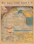
All of the digitized maps are available for download in high resolution (the full Niagara view was so huge my server couldn’t even handle it, and my server is used to the strain, believe me), or if you prefer, can be zoomed in extreme closeup on the Cornell site itself. Fair warning: this is a timesink of gloriously massive proportions. The How Japan Could Attack U.S. by Howard Burke for the Los Angeles Examiner, November 7, 1937. A prescient map of how Japan could attack the US starting with Hawaii. Image courtesy the PJ Mode Collection.information on each entry was written by PJ Mode himself based on his research. He makes no claim to flawless understanding, so if you find something you think might be inaccurate, you’re encouraged to click on the “Contact” link at the bottom of the page and let folks know.

Speaking of which, the following video is 50 minutes long, but it’s so worth it. It’s a talk PJ Mode delivered last year to The Grolier Club and the New York Map Society about persuasive cartography. Unlike most lecture videos, the people doing the talking only appear rarely. The vast majority of the presentation is of the maps being projected. I can’t tell you how many times I’ve been irritated by the neglect of the visual aids in recordings of these types of events. Whoever filmed this talk deserves an award. Be sure to watch it full screen so you can see the small details of the map as large as possible.