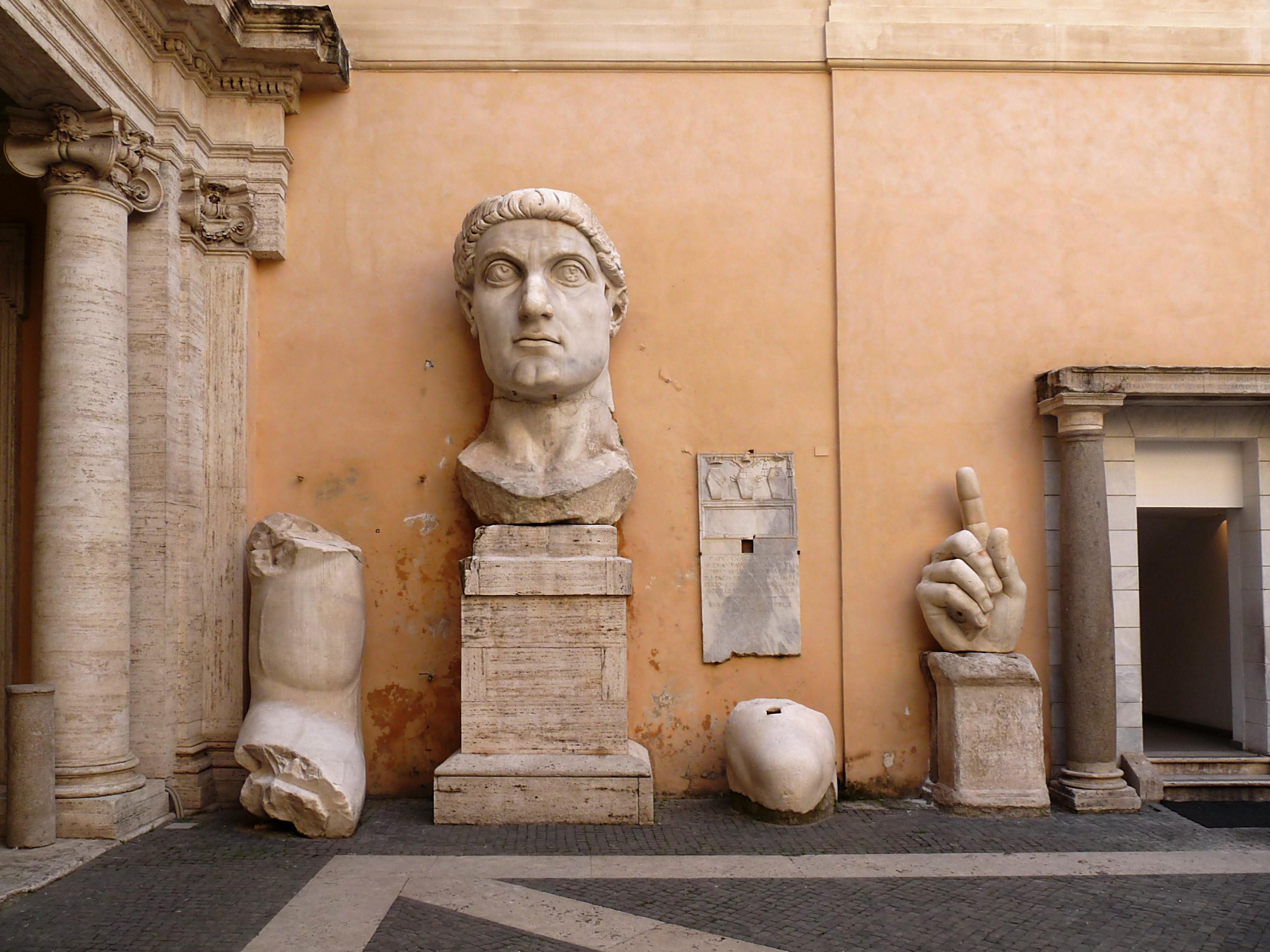
Archive for the ‘Multimedia’ Category

Color films of Britain in the 1920s

Sunday, May 12th, 2013

A reader — he knows who he is — pointed me to this video, a remarkable color film of London in 1927 that has been making the Internet rounds the past couple of days. The uploader notes that it’s the work of British film pioneer Claude Friese-Greene using a color process invented by his father William. The name rang a bell because last year I wrote an entry about the restoration of the earliest natural color movies (as opposed to ones shot in black and white and then tinted by hand afterwards), experimental films shot in 1902 by Edward Raymond Turner using a three-color process patented in 1898 which he was never able to develop into a practical working model of camera and projector.

After Turner’s premature death, investor and American film producer Charles Urban hired early film pioneer George Albert Smith to continue where Turner had left off. Smith simplified the Turner process by dropping the blue and turning it into a two-color red and green process called Kinemacolor which Urban and Smith patented in 1906. The black and white film was shot through red and green filters and then projected through them. Even though it required special projectors, Kinemacolor was a hit from its first public showing in 1908. At its peak popularity, more than 300 theaters in Britain had installed Kinemacolor projectors.

It was William Friese-Greene who dethroned Kinemacolor. An avid photographer and inventor — he got more than 70 patents for his inventions during his lifetime — William Friese-Greene drove himself into bankruptcy repeatedly with his passion for moving pictures. One of his inventions was a two-color red and green film process he called Biocolour which he patented in 1905. The process required exposing alternate frames of film through red or green filters and then staining them red (for the green filtered frames) or green (for the red filtered frames). The end result suffered from flickering and very visible red and green edges around figures in rapid motion, but so did Kinemacolor. That was the nature of the beast with these early two-color systems.

In 1911, he tried to sell his system to filmmakers and movie theaters. Biocolour had one great advantage over Kinemacolor: it played through regular projectors, no special equipment necessary, but Kinemacolor’s popularity and the strength of its patent stopped him in his tracks. Urban filed an injuction against Biocolour Limited in 1912, on the grounds that Biocolour’s two-color red and green process was an infringement of Kinemacolor’s 1906 patent. Friese-Greene challenged the injunction on the grounds that Kinemacolor’s patent was too broadly written and not detailed enough to cover the Biocolour process. He lost in the lower courts but an appeal to the House of Lords was ultimately decided in Friese-Greene’s favor in 1915 because Smith had not specified in the patent which exact colors were necessary for his process to work. He claimed that any two colors from nature would work, which was not at all the case, hence the years of struggle from Turner’s first experiments until Smith’s success with red and green.

William Friese-Greene’s win killed Kinemacolor, but with no funding and a World War going on, he was unable to convert his legal victory into theatrical success. He died penniless in 1921. His son Claude picked up where his father left off, developing and improving Biocolour. In the mid-1920s, Claude traveled the length of Britain from Land’s End in Cornwall to John o’ Groats in Scotland, filming in the “new all British Friese-Greene natural colour process.” The result was a travelogue of Britain in 26 ten-minute episodes called The Open Road which is the source of those shots of London linked to above.

Here’s the full London shoot done in 1927 at the end of the three-year voyage. The little girl selling peanuts at the cricket match slays me.

You’re not seeing what audiences would have seen, however. The British Film Institute digitally restored the film to remove the flickering and clean up the color. The entire film was shown on British television in a BBC documentary series in 2006. The DVD is available on the BFI website.

The British Film Institute’s YouTube Channel has more than 60 extracts from The Open Road, most of them less than a minute long but all of them riveting. The color film has a way of making these scenes, now almost a century old, feel much closer to our present. At the same time, they are still very much of a time gone by, an immensely compelling combination.

My favorite scenes are the ones that capture people at work. There are fishermen bringing in the catch and herring girls gutting it in Oban, Scotland (1926):

Three generations of weavers in Kilbarchan, Scotland (1926):

Harvesting on Earl Bathurst’s Estate using traditional oxen in Cirencester (1924):

A potter at his wheel and the ladies painting Wedgwood Etruria pottery (1926):

I also love the ones where Claude took full advantage of the red and green process by filming things that are particularly red and green.

Dingle Gardens Shrewsbury, Shropshire (1926):

Gingers enjoying a bathe by the sea at Torquay, Devon, in 1924:

From a historical perspective, I love the Roman baths in Bath in 1924 and the charming utter lack of thrills and chills on the Reed, a ride at Blackpool Pleasure Beach, Lancashire, in 1926.

Really I could post every last one of them. There are no duds here. I highly recommend spending a few hours watching them all, which is exactly what I did today.

Share

Richard III documentary airs on Smithsonian Channel

Tuesday, April 23rd, 2013

The Smithsonian Channel is airing a documentary on the discovery of Richard III’s skeleton. I caught The King’s Skeleton: Richard III Revealed last night. You can watch it next on Saturday, April 27th at 5:00 PM, and on Sunday, April 28th at 10:00 AM.

Even though it was advertised as “new,” I assumed when I saw it on the schedule that it was The King in the Carpark, the documentary that aired on Channel Four in the UK the day of the announcement. I think in substance it is the same documentary, but there have been some changes made for a US audience. The only one I can identify for sure, not having seen the UK version, is that the narrator is American. If anybody has seen them both, I’d love to hear of any other differences you detected.

The cameras follow Simon Farnaby, a comedic actor and writer I’ve never heard of before whose sole tenuous relevance to this story that I could determine is that he’s from York. Anyway he seems to be the Greek chorus, our stand-in of ignorant wonder to whom the archaeologists, historians and scientists explain things in lieu of addressing the viewer directly. He also serves to hold Philippa Langley’s hand, metaphorically and literally, whenever she hyperventilates.

Much of the story of the dig, discovery and analysis is known to me now, but there were still some interesting surprises in the documentary. For instance, the team noted at the February press conference that the skeleton was actually found on first day, but they didn’t get into the details of that. The documentary shows the discovery, how those leg bones are the first thing found at the dig, how they’re covered back up to wait for future information since at that point they have no idea if they’d even found the Greyfriars church and priory yet.

Thirteen days later, all three trenches have been dug and archaeologists are able to determine from the artifacts that this was the Greyfriars site and the layout of the structures. Once the floorplan is clear, they return to those skeletal legs because they now realize that they are buried in the east of the church under the choir, which was exactly where Richard III was thought to have been buried.

Fun fact: after they cover the bones back up on day one, storm clouds quickly gather and it began to rain. Philippa Langley thinks that’s downright eerie. Rain in England at the end of August? It feels like a message from Richard, donchaknow. Certainly not an entirely expected minor weather event seen every day. Certainly not that.

Another interesting bit is when Simon visits a historian who shows him a couple of paintings of Richard and how they were tampered with, Medieval Photoshop style, by Tudor artists to make Richard look freaky. They added curves to one shoulder to make him look hunchbacked, narrowed his eyes, even carved his thumb to a point so it looks like he has a demon claw rather than regular human fingers.

Meanwhile, back at the dig they bring the earth movers in to extend the first trench crosswise at the place where the leg bones were found. The original trench isn’t wide enough to expose the rest of the skeletal remains, so the machines have to peel off more pavement and modern layers of soil while the precious legs bones were just beneath them. It’s amazing how delicate heavy machinery can be.

Next up is bone specialist Joe Appleby who takes over in her Outbreak suit to do the careful excavation that will hopefully reveal the rest of the skeleton. Yay she finds a skull! Oops, she found it when she drove her pickaxe through it. It’s cool, though, because the skull is at a weird angle compared to the legs so it’s probably not from the same skeleton.

Twist! Yes it is! The weird angle, Joe finds, is due to the marked curvature of the spine. She calls in Simon and Philippa to show them what she’s found, and Philippa loses the ability to stand when she sees that s-curve in the spine. She has to sit down on a mudpile because that’s one of her biggest bugaboos: Richard couldn’t have been a hunchback because how could he have worn armour and fought?

Then Joe makes her feel better. At least there’s no evidence that his right arm was withered, she tells Philippa. Philippa replies: “Some good news them.” Yes, finally some good news after the tragic discovery of a skeleton with scoliosis in the location where Richard III was buried.

The bones are bagged and sent to the lab for the long process of analysis. The skull goes to Turi King because she’s going to attempt DNA extraction from the teeth. You see her removing one of them, but the narration uses the plural so she had to remove more than one, clean them and grind them into powder in order to get any DNA out of them. That answers the question of whether the tooth loss visible in the skull was pre, peri or postmortem.

The DNA results are going to take months, so off goes Simon to York to talk about how Richard was perceived by the locals. Spoiler: they liked him.

Back at the lab again, we get to see the process of identifying the metal object that was found between two of the skeleton’s vertebrae. The researcher X-rayed the piece, compared it to arrows of Richard’s time and ultimately determines that it’s not an arrowhead but a pre-existing nail, possibly Roman, that just happened to wind up in the burial.

There’s also a rather cool bit about the creation of the facial reconstruction using specialized software. It’s neat to see the muscles being digitally added on to the skull.

So finally it’s time for the full osteological presentation. Philippa, Simon, Joe Appleby and Dr. Pierce Mitchell (specialist in deformities) meet over the bones. Mitchell says he would have been a hunchback with one shoulder higher than the other. Philippa freaks. Out. She can’t stay in the room anymore because she can’t deal with seeing him laid out like that with his glaring scoliotic spine making a mockery of her years of dedication to the idea that the only deformity in Richard was projected onto him posthumously by Tudor propagandists. Simon has to go out and pet her for a while to validate her tender feelers.

When they return, Mitchell points out that when he calls him a hunchback, he just means in the colloquial sense of someone with a spinal deformity. He didn’t actually have a hump on his back. When he was clothed, it would only look like one was shoulder slightly higher than the other.

Things get weird again when the facial reconstruction is complete. Philippa, led by Simon, enters the room with her eyes closed. She opens them to behold the reconstructed face of Richard III. “Doesn’t look the face of a tyrant. I’m sorry, but it doesn’t. It’s like you could just talk to him. Have a conversation right now.” She does not lean in for a kiss, but that’s the level of vibe we’re talking about here. There’s a reason they didn’t leave her alone with him.

The show concludes with the DNA results. Adorably, Turi King takes Michael Ibsen to a private room to share the results with him first, because he’s family. Then she tells Simon and Philippa and there is much subdued English rejoicing.

My final verdict is that it’s definitely worth watching just to see the discovery unfold the way it did. It’s lighter on the science and archaeology than I would have liked, but I was steeled for that by the many excellent comments y’all left on the Richard blog entries.

A positive final note: there are no cheeseball reenactments of historical events. When historians and the narrator are talking about Richard’s rise to throne, his life, the princes in the tower, the Battle of Bosworth, his death, the descriptions are accompanied with a stylized, highly atmospheric animation. The art is kind of great and there are some excellent ravens involved. I really enjoyed the animations. Whoever did that needs to make a feature-length movie of the life and death of Richard III.

Edit: Here’s an animated telling of Shakespeare’s Richard III courtesy of WandaSusie which is very similar, if not identical, in style. I can’t tell if it’s the exact same animation as figures in the documentary, though.

Share

The Digital Public Library of America opens today

Thursday, April 18th, 2013

At noon today, the Digital Public Library of America opened for business. Modeled on the greatness that is the Europeana library, the DPLA collects more than two million objects from museums, historical archives, universities and libraries across the country. The focus is American cultural history as reflected in photographs, manuscripts, letters, maps, artifacts, books, audio, films and more, all drawn from contributing institutions like the Smithsonian, the National Archives, the New York Public Library, Harvard University, the David Rumsey Historical Map Collection and the University of Virginia. The DPLA conveniently collates material already online — things you could find if you searched the websites of those institutions individually — but it also includes items that have been digitized but were isolated on local computer systems.

The library’s goal is to be a history-targeted Google, a vast repository of historical information that is open to the public and fully searchable. It has none the barriers that keep certain institutional sites from being included in Google search results, and unlike Wikipedia, its contents are mainly primary sources. The hope is that it will prove itself to be an invaluable tool for research, where students, teachers, scholars, journalists and happy nerds in general can get information from the horse’s mouth instead of via layers of edited composition. You can search by keyword, or browse by subject, and if you register for an account, you can save your searches, individual items and exhibitions and make shareable playlists out of them.

The contents are not exclusively American since many of the contributing institutions have artifacts from other countries that have been uploaded to the digital library, plus there are collaborations with international counterparts planned. DPLA has already partnered with Europeana on an app which allows users to search both databases at once, and they are working together to create an exhibition about European emigration to the United States during the boom years of the 19th and 20th centuries. The exhibition will bring together manuscripts, photographs, historical records from the Bibliotheque Nationale de France, the National Gallery of Ireland, the Jewish Museum of London, the Royal Library of the Netherlands, the Saxon State Library and the Norwegian Photo Archives.

That one is not available yet, but the library has compiled seven online exhibitions to kick off festivities. What’s cool about them is they each have a local flavor since the topics are drawn from specific partner collections and then fleshed out with additional substance from other institutions. For example, the History of Survivance: Upper Midwest 19th Century Native American Narratives exhibit is about Native American communities in Minnesota. It taps the Minnesota Digital Library and Minnesota Historical Society for period photographs and artifacts which exemplify the times and cultures being explored.

It’s the kind of thing you would get to enjoy if you lived in Minnesota and could check out the new show at the historical society. Most people don’t have that opportunity, however, and I love that even with its vastly wide rubric, the DPLA is dedicated to showcasing local history. The Minnesota sites are excellent in their own right, but I don’t know how many times I’ve been researching a story or link-surfing only to reach a local history site that has very limited resources and few options for sharing the wealth of their collections, archives, curatorial knowledge. The DPLA can give those sorts of institutions a great boost to their Internet presence as well as send them new real-life eyeballs.

The best part, other than having everything in one place, is how easy it is to stumble on collections you didn’t know existed. Did you know that Harvard University Library has a collection of 3,500 daguerreotypes, 3,106 of which have been digitized and are available to view over the Internet? I can never get enough of daguerreotypes so that’s good and bookmarked now. I found that by popping around the timeline, and I found the Digital Library of Georgia by letting my clicking finger do the walking over the map.

There are still some vagaries and bugs here and there. If you travel the timeline, for example, and drag the selecting tool to the decade you want, there are bars of varying length reflecting the number of artifacts in the database from the years you picked. However, sometimes when you click on a year that in decade view claimed to have an item, in year view it’s showing zero items. Also, when you’re going through the exhibits and you click on the information icon, the info includes the URL to the artifact on its home website, but it’s not hot so you have to copy and paste it into the browser address bar to go there. Another nit to pick is that the images, while almost all of them are highly zoomable, can’t be opened full-size.

That’s small potatoes, though. Let’s not forget that when Europeana debuted, it was so hugely popular that the whole site crashed and was completely out of commission for months. Minor weirdnesses are to be expected in the early days, and the DPLA is going to be expanding mightily over the next years. Future plans include apps, the library used a developer platform by third parties, partnerships with additional institutions and, avoiding the controversies that bogged down Google Books, some kind of digital lending model for works — books and other media — that are still under copyright.

So off you go, then. Cancel all your plans for the weekend and have yourself a voyage through time, space and culture instead.

Share

New and improved virtual 3D Etruscan tomb

Saturday, April 6th, 2013

The 7th century B.C. Regolini-Galassi tomb in the Etruscan necropolis of Cervetri and the 300 artifacts discovered inside of it were laser scanned and digitized for a virtual museum exhibit in 2011. I wrote about it when the reconstruction debuted at the Allard Pierson Museum in Amsterdam and the National Museum for Antiquities in Leiden, and we were fortunate to get a review from Richard who commented that although there was a lot of good information and it was cool to see the tomb laid out in its original configuration, the interface was somewhat unwieldy and moved at its own pace regardless of user preference.

After that first display, the CNR-ITABC (National Council of Research – Institute for Technologies Applied to Cultural Goods) in Rome spent more than a year working on a new version of the Etruscanning3D application. The updated software was brought to the Italian Science Festival in Genoa and the ArcheoVirtual exhibition in Paestum in November of 2012 where flocks of children and adults took it for a spin. It won an award for best new application at ArcheoVirtual exhibition and was voted the favorite of the visitors.

The new version addresses the main issue Richard raised in his comment: it allows the user to navigate the virtual tomb freely. Instead of being taken through the tomb and having artifacts described in groups, users can now walk at their own pace and select individual objects to find out more about them. The tomb also contains considerably more artifacts than the first version did, all of them digitally restored so they look like they did when in the 7th century B.C.

This entry describes the digital restoration of a situla, a cylindrical ritual bucket made of wood with a silver cover of animals and palmettes. They used turntable photography to create an all-around picture that could be unwrapped, then they created a displacement map which simulates surface details like the embossed and engraved silver designs. Once the details were laid out clearly in the unwrapped image, the team was able to see how the shapes were hammered and then recreate that same texture to fill in the missing spaces.

CNR-ITABC has continued to improve the application, adding more artifacts and more flexibility. A version using a Kinect camera and floor hotspots is debuted in March as part of the exhibition on the Etruscans at the Gallo-Roman museum in Tongeren, Belgium. As of Wednesday, April 3rd, the virtual Regolini-Galassi tomb was officially installed at the Vatican Museums where the full collection of real-life artifacts from the tomb are on permanent display.

The virtual experience is still not available in its entirety online. The video clip in my original post (now no longer accessible) was in Dutch, but here’s a video of the new version of the application in English which shows how a user navigates the tomb using hotspots in the floor and the simplest of arm gestures.

Share

Van Dyck painting found thanks to online database

Thursday, March 14th, 2013

A painting by Flemish Baroque master Anthony Van Dyck has been discovered in storage at the The Bowes Museum by an expert who came across it on the BBC’s Your Paintings website. Art historian and dealer Dr. Bendor Grosvenor was perusing the Public Catalogue Foundation’s massive database of all 210,000 publicly owned paintings in the UK (online at the Your Paintings site) to research an upcoming exhibition when he spotted the Portrait of Olive Boteler Porter.

The portrait had been in the collection since the museum opened in the market town of Barnard Castle in north east England in 1892. It was purchased in Paris by the museum’s founder John Bowes in 1866. When he bought it both the sitter and artist were unidentified. The museum later determined the subject was Olive Boteler Porter, wife of Endymion Porter, a good friend of Van Dyck’s, and lady-in-waiting to Henrietta Maria, wife of King Charles I, but the painting was still listed as “a copy after Sir Anthony Van Dyck.”

Years of caked dirt and yellowed varnish had kept the portrait off the gallery floor and in storage. When Grosvenor raised the prospect that it could be a work by the master himself, the Bowes enlisted him and his colleagues at Philip Mould & Company who have conserved more than 20 Van Dyck’s to clean the painting. Taking a minimalist approach — removing all but the oldest layer of varnish and doing some minor retouching in areas where the paint was removed by prior cleanings, most notably in the left eye — conservators were able to reveal the glowing delicacy of the skin tones, fabric and draping.

Philip Mould now officially confirmed that Grosvenor’s eye was unfailing, that the painting was a genuine Van Dyck. Other Van Dyck experts, including Christopher Brown, director of the Ashmolean Museum in Oxford and Rev. Dr. Susan Barnes, co-author of Van Dyck: A Complete Catalogue of the Paintings, were brought in to assess the cleaned portrait and they all agreed that it was the real thing. When Ms. Porter returned to the Bowes, she was given pride of place on the gallery wall. No more storage for her.

The wheel has come full circle for Olive Boteler Porter, who followed her husband out of the country in 1646 when all field resistance stopped in the Civil War and Parliament was in control of the country. Olive had taunted Parliament repeatedly. She had adopted the queen’s Catholicism in 1637 and was a most vigorous adherent of her new faith, converting several noblewomen and absconding with her dying father, brother of the Duke of Buckingham, in an attempt to save his immortal soul before it was too late. She and Queen Henrietta openly defied Parliament, flaunting their successful conversions in a parade at Christmas. The Puritan-dominated Parliament was not amused. They saw Olive as a fifth columnist, maybe even a spy for Spain, and that suspicion spilled over onto her husband even though he never converted.

The painting was probably done around the time of her conversion. Van Dyck painted several portraits of her, alone and with her husband. Endymion Porter also bears the distinction of being the only person Van Dyck ever painted standing next to him in a double portrait now in the Prado Museum.

When the Porters fled England, they probably took the painting with them, which is how it ended up in France, and under great financial duress, sold it. There’s a wax collector’s seal on the back that marks it as property of either Henri, 2nd Duc de Montbazon (d.1654) or his son Louis (d.1667). Two hundred years later, John Bowes bought the painting from his favorite Paris Dealer along with another painting attributed to Van Dyck said to be of Henrietta Maria. That was the one from the school of Van Dyck, while the lady-in-waiting is the real deal.

When I blogged about the Public Catalogue Foundation’s project and the Your Paintings database in December 2011, they had just reached the halfway mark with 104,000 paintings uploaded. Less than a year later, all 210,000 public paintings in the UK were photographed and uploaded to the BBC website. Out of the 210,000 works by 45,000 artists, 30,000 of them are unattributed. It’s tremendously exciting that the online database is directly responsible for matching one of those orphans with its artistic father.

The saga of the newly discovered Van Dyck was the subject of a recent episode of The Culture Show (not available outside the UK), a BBC program hosted by Bendor Grosvenor. You can also read a fascinating account of the characteristics that mark the portrait as Van Dyck’s work and the research into its provenance on Grosvenor’s website.

Share

Behold the Panther Cave pictographs in enhanced HD

Sunday, March 10th, 2013

Panther Cave is a rock shelter in Seminole Canyon State Park, Texas, named for a dramatic leaping cat that is the largest of its many pictographs. Copious overpainting indicates the site was used as a canvas by generations of rock painters. Cats, humans wearing headdresses, abstract figures from six inches to more than 10 feet high decorate the rock face.

The images are predominantly in the Pecos River and Red Linear styles and date back about 4,000 years. Pecos River Style is the oldest, starting around 5000 years ago. Its iconography features monumental polychrome designs of zoomorphic figures and of anthropomorphic figures called shamans. Pecos River art is thought to have had ritual significance, perhaps having been painted for ceremonial religious purposes. Red Linear style is characterized by small red stick figures engaged in a variety of shared activities like hunting, fighting, sex and childbirth. Red Linear figures often incorporated the older large Pecos River animal figures in their scenes.

The art of Panther Cave is not accessible to the general public. The rock shelter can only be reached by taking a boat down the Pecos River and the condition is precarious. Erosion has made it too dangerous for archaeological excavation and the construction of Amistad Reservoir has put the site in more immediate danger from flooding.

Acutely aware of the precarious situation Panther Cave and other rock art sites find themselves in, the SHUMLA Archeological Research and Education Center launched the Lower Pecos Rock Art Recording and Preservation Project in 2009. Its aim is to document ancient pictographs using the latest and greatest technology to preserve them digitally. So far they’ve completed work on 21 rock art sites.

In collaboration with the Amistad National Recreation Area, Seminole Canyon State Park, and Geo-Marine Inc., SHMULA has now recorded and laser scanned the art of Panther Cave. They used 3D modeling software to showcase the natural contours and shape of the cave, then used color enhancement to highlight the stunning complexity of figures that are not clear to the naked eye. The finished product is a riot of color, giving viewers whole new insight into the pictographs that layer the site.

Share

The Little French Renaissance Book of Love

Thursday, February 14th, 2013

A recent addition to the British Library’s most excellent collection of digitized manuscripts is a valentine that puts contemporary efforts to shame. Written by Pierre Sala around 1500, the Petit Livre d’Amour (Little Book of Love) is a 5-inch by 3.7-inch book of poems and prose that he hand-wrote with gold ink on purple parchment and had professionally illuminated as a gift for his lover Marguerite Builloud. He even had a wood and leather carrying case made with rings on the edges so his lady love could hang it from a chain on her girdle.

Pierre Sala was a renown humanist, author, cook, personal valet and equerry to King Louis XII. Born and raised in Lyon, a center of the French Renaissance, his writings are important transitional works in the shift from the scriptural, patristic approach to scholarship of the Middle Ages and the Renaissance revival of classical philosophy and secular sources of knowledge. He wrote about the lives of Greek philosophers, collections of ancient aphorisms, histories, treatises and of course, romances and poetry.

He was also something of an accidental archaeologist and antiquities collector. When he built his house on the hill of Fourvière in the center of Lyons in 1514, he unearthed a large number of Franco-Roman remains from when the city was known as Lugdunum. This collection was so impressive the king came to visit it like a tourist in 1522. Pierre even named the house Antiquaille after them.

By then, he had sealed the deal with Marguerite. Perhaps this book helped. It is replete with references to the two of them. M and P are carved into the stylized floral pattern on the wooden cover. Their initials, drawn out of crossed compasses, decorate the pages like in a middle schooler’s Trapper Keeper. (I am aware I just seriously dated myself there). The poems and illustrations are all about love, of course, but not necessary mushy expressions thereof. The alternative name of the volume is “The Enigmas of Love” and the hardships of love, the obstacles, the dangers, are the dominant theme of the 12 drawings and the quatrains they illustrate.

Pierre starts off telling Marguerite that he wants to put his heart inside this daisy (Marguerite meaning daisy in French), that his thoughts will always be with her. The drawing opposite depicts a man putting his heart into daisy. His facial features are very basic, deliberately left so by the illustrator, a Parisian artist known as the Master of the Chronique scandaleuse, so another artist could fill in the details to make him look like Pierre. That artist was probably Jean Perréal, a painter in the employ of the French royal family who was a personal friend of Pierre’s. Perréal never did in fill the face, but he went on to make the rather dreamy portrait of Pierre at the end of the book.

The daisy allegory is followed by a man playing blind man’s bluff with three ladies, with the accompanying poem expressing his hope that if he can catch at least one of them, she won’t escape for a year. The next poem urges caution in Italian but recommends he not despair even though there are no assurances. The drawing across from it is of a solitary table with a candle burning on top.

The cautionary tales and juxtapositions — a wise man painting a fool, a pilgrim and a beggar illustrating the proverb “don’t limp in front of a lame person,” a man carrying a man on his shoulders while trampling another man on the ground illustrating the proverb “trampling on one man to help another” — continue through to the end.

My favorite is two women trying to catch flying hearts with a net. The quatrain describes the ladies as Friendly Expression and Courteous Manner who have stretched out their net to trap the unstable hearts that pass by. The best thing about that is the poem doesn’t spell out the word “heart.” It’s a little <3 drawing, a Renaissance emoticon!

We don’t know if she ever wore it like a hipster chain wallet, but Marguerite must have liked it, or at least not hated it too much, because she and Pierre were married and lived together at Antiquaille until his death in 1529.

Share

Traprain Law silver dish digitally reconstructed

Friday, February 8th, 2013

Traprain Law, a hill of volcanic rock in East Lothian, Scotland, looms ferociously over the surrounding plain making it an ideal location for a fort. Excavations have found evidence of dense settlement and defensive ramparts going back to 1000 B.C. In the first century A.D. it was occupied by a tribe the Romans called the Votadini (Gododdin in ancient British) who used it from about 40 A.D. certainly until about 400 A.D., with a short break around the end of the 2nd century when Romans went deeper into Scotland and built the Antonine Wall only to pull back to Hadrian’s Wall a few decades later.

Some time around 410 to 425 A.D. or possibly even later, somebody buried a large quantity of Roman silver on Traprain Law. Fifteen centuries later, on May 12th, 1919, the hoard was unearthed on the western shelf of the hill by workmen excavating under the absentee direction of Alexander Curle, a lawyer who was also Director of the National Museum of Antiquities of Scotland, and James Cree who was usually the hands-on supervisor but had the unfortunate timing to have been in the States during the 1919 dig season.

It was a massive find, weighing over 53 lbs composed of 250 fragments from about 150 objects of high quality silver in different styles and motifs that indicate they were manufactured in various workshops around the Roman Empire. There are a few complete pieces, but most of it is what is known as hacksilver, larger silver objects that have been cut into bits. Table silver — flasks, goblets, bowls, plates, spoons, ladles, serving dishes — make up the bulk of the hoard, with some objects from a lady’s dressing table, buckles and strap fittings from an officer’s uniform, early Christian items that may have been part of a church service or belonged to a wealthy Christian family, and four clipped coins from the emperors Valens (Eastern Roman emperor from 364 to 378), Arcadius (Eastern Roman emperor from 395 to 408) and Honorius (Western Roman emperor from 395 to 423).

It’s largest hoard of Roman silver ever discovered outside the borders of the empire and the largest hoard of hacksilver ever found anywhere.

The initial assumption was that this silver was loot, the spoils of barbarian incursions into Britannia during or just after Rome’s departure. By this theory, the barbarians hacked up the artifacts after they pillaged them because, you know, barbarians. That’s not much of an explanation, though, and archaeological evidence uncovered at Traprain Law shows that the Votadini had a productive relationship with Rome. The settlement is littered with Roman artifacts like brooches, glass, pottery, tweezers and ear scoops that indicate regular trade and the influence of Roman culture over several centuries.

Recent research has suggested a more plausible explanation, that the hoard was payment for mercenary services rendered or a diplomatic gift to ensure the loyalty of a friendly chieftain. With currency hard to come by in the waning days of Roman Britain, cut up precious metal objects acted as bullion. By this theory, the objects were cut and flattened within Roman territory, measured, weighed and sent over the border. Some of the pieces were crushed into scale-sized packets weighing up to three-quarters of a Roman pound which fits nicely with the payment idea.

Two of the fragments are all that remains of a large silver dish decorated with a beaded rim and a geometric border with floral accents and portrait busts. The border is gilded and inlaid with a mixture of copper, silver and lead that produces a black enamel-like material called niello. They weigh almost exactly eight Roman ounces which suggests a deliberate cutting so they could be used as bullion for their metal weight.

From the curve of the edges it’s clear that the pieces are quite small relative to the overall size of the platter but we didn’t know just how small they were until laser scanning allowed experts at the National Museums of Scotland to create a digital reconstruction. The complete dish was an impressive 70 centimeters (27.56 inches) in diameter making it one of the largest dishes known from the Roman world. It would have been used to carry food on the most important occasions.


That floral decoration in the middle of the platter is speculative since the surviving fragments are both edge pieces. A similar dish found in Switzerland had an engraved medallion in the middle which served as the model.

Here’s video of the digital reconstruction:

Share

Vintage postcards, the Michelin Man & fighting TB

Saturday, January 5th, 2013

It all started with an exhibition at the Boston Museum of Fine Art. I’ve mentioned before that I am an avid lover and collector of postcards, so whenever a museum puts on a show of vintage postcards, I go full obsessive and try to hunt down as many pictures of it as humanly possible. The Postcard Age at the MFA looks like a particularly great display of hundreds of carefully selected gems from the massive collection of Leonard A. Lauder, the billionaire chairman emeritus of Estée Lauder Companies, Inc., and son of legendary cosmetics entrepreneur Estée.

Lauder has been collecting postcards since he was six years old when he fell in love with an Art Deco postcard of the Empire State Building. It cost a penny. He spent his entire nickel allowance buying five of those postcards. Thus began a love affair that continues to this day. His collection of cubist masterpieces is worth hundreds of millions of dollars and known worldwide, but it was the humble postcard that made a collector out of him. His postcard collection today numbers around 125,000 pieces, and that’s after he donated 20,000 early 20th century Japanese postcards to the MFA some years ago.

He has pledged to donate another 100,000 to the museum. Out of that hundred thousand, Lauder and MFA curators Lynda Klich and Benjamin Weiss selected almost 700 postcards from the decades around the turn of the 20th century to put on display in The Postcard Age. This was the time when picture postcards, first sold in the Austro-Hungarian Empire in 1869, became all the rage. By 1900, billions of postcards of advertising graphics, travel photographs, famous people, famous buildings, sports events, conventions, World’s Fairs, the latest technology, were sent all over the world. At a penny per stamp, they were cheaper than phone calls, fast and pretty. They were also purchased and kept in scrapbooks. In an era before cameras were readily available and easy to use, you could document your trip to exotic locales with postcards.

The postcard craze was such a huge thing that there are even postcards about postcards, some advertising postcards as a means to stay in touch with friends, others dedicated to the worldwide phenomenon of the postcard craze itself. You can see some of the highlights of the exhibit in this MFA slideshow and in this one on the Huffington Post. Imprint has some superb pictures from the exhibit accompanying this article about the exhibit that also includes a fascinating interview about the history of postcards with pop culture historian and graphic designer Jim Heimann. A book of the exhibition with many more pictures is available here.

One postcard in the slideshows particularly caught my eye. It’s a photograph of two enormous Michelin Men riding a horse-drawn cart through the streets of Houston, Texas, around 1904. The Michelin Man was just six years old in 1904. The idea of an anthropomorphic tire pile came to Edouard and André Michelin in 1894 and when in 1898 the French cartoonist Marius Rossillon, aka O’Galop, showed André an image he had drawn for a brewery of a Falstaffian figure toasting “Nunc est bibendum” (“Now is the time to drink,” a quote from one of Horace’s odes), Michelin suggested the figure be made to resemble a human tire pile. The first Michelin Man thus became known as Bibendum after the slogan. It’s that early character with his pince-nez glasses you see advertising Michelin tires in person in Houston.

His creation of one of the world’s most enduring and recognizable trademarks is what O’Galop is mostly known for today, but what I just found out while obsessing over that picture is that O’Galop was also a pioneer of film animation. Starting in 1910, he and biologist Dr. Jean Comandon, a pioneer in his own right of slow motion and microcinematography (filming through a microscope), worked together to create films on good hygiene and disease prevention. A disturbingly awesome example of their oeuvre is On Doit Le Dire, a 1918 short about the dangers of syphilis which combines animation, pictures of real people’s syphilis lesions and film of spirochetes under the microscope.

O’Galop also lent his animation talents to the Commission for the Prevention of Tuberculosis in France, an agency of the Rockefeller Foundation which worked closely with French national and regional governments and the Red Cross to reduce the rates of tuberculosis which had been driven sky-high by the deprivations of World War I. Precise mortality statistics are hard to come by during wartime, but we do know that 291,412 people died of tuberculosis between 1915 and 1918 in 77 of France’s 87 departments. The proportion of deaths was higher in occupied areas.

The Rockefeller Foundation had been involved in disease prevention, primarily the eradication of hookworm disease, for many years. In 1917, it created the Commission to combat the increase of tuberculosis in France. The Commission took a comprehensive approach to the fight against TB, starting with the collection of reliable statistics to define the extent and range of the problem, then establishing a system of anti-tuberculosis dispensaries, clinics all over the country with modern equipment and highly trained staff to treat tuberculosis cases. Each dispensary had a thoroughly equipped mobile dispensary that would bring a doctor and assistants to centrally located villages where all applicants would be tested, diagnosed and treated. It also trained of nurses who headquartered in the dispensaries and did house calls to test and treat. Because of their peripatetic duties, the nurses, all women, were called Visiteuses d’Hygiene (visiting hygiene ladies).

A public education campaign was the fourth prong of the Commission’s efforts. During the war, striking propaganda posters defined tuberculosis as an enemy to be battled just like Germany out of patriotism. There were also educational posters which used simple cartoons and drawings to explain how to prevent tuberculosis (sleep with windows open, no public spitting or sharing bottles) and if you have it, how to keep from spreading it (sleep alone, spit into containers and destroy the contents).

The education campaign also had a traveling component. The Mobile Tuberculosis Exhibit, a truck filled with pamphlets and posters that could be set up in a public space, 42 films and a projector, drove around the country to spread the word on stopping the spread of TB. Many of these exhibitions were targeted towards children for whom O’Galop’s animated films were a major draw. The were cartoons, but they certainly didn’t treat the subject gingerly.

They also didn’t just stick to TB. Medical opinion at the turn of century asserted that alcoholism, both acquired and hereditary, was a major cause of TB. Thus the fight against tuberculosis also required a fight against alcoholism — and not just alcoholism as we define it now; even one spiritous beverage a day was alcoholism for their purposes.

Hence the following triad of O’Galop films: Small Causes, Big Effects, Resisting Tuberculosis and The Alcohol Cycle. (You can watch a version subtitled in your choice of English, Italian, German and Spanish on the excellent Europa Film Treasures website.) Resisting Tuberculosis is my favorite. It starts at 1:50 and features some outstanding animated skeleton work.

Share

The first recordings of a family Christmas

Tuesday, December 25th, 2012

As ever, I am a sucker for a theme post and the curators of the Museum of London have graciously hooked me up with just the thing. They have restored and uploaded to their website what may be the first surviving home recordings of a family Christmas.

Starting in 1902, patriarch Cromwell Wall began recording family get-togethers and events on wax cylinder phonographs by Columbia Home Grand Graphophone. Cromwell Wall was a civil engineer who worked in a London firm his father had co-founded in the late 19th century. He and his wife Minnie had nine children and lived in a home called Lyndale in the London suburb of New Southgate. Minnie’s parents and Wall’s parents lived in the same neighborhood. The families along with cousins and uncles got together on the holidays and made merry, merry which Cromwell saw fit to record on carefully labeled wax cylinders.

At this time, home recording equipment was expensive and rarely seen in homes. It was the province of office work, a rudimentary form of the Dictaphone. Cromwell took the phonograph home and recorded their holiday toasts, parties, carol singing and musical recitals. When the action moved outside their home, Wall packed the equipment in the baby’s stroller and rolled it along with them to various events. The pram phonograph traveled the neighborhood to the in-law’s house (Toppesfield), Cromwell Wall’s parents’ house (the Oaks), to St. James the Great Church and once to Grove Road Baptist Chapel to record the bells peeling on New Year’s.

According to Julia Hoffbrand, curator of social and working history at the Museum of London, experts who have listened to the restored recordings have declared their quality outstanding, superior even to the commercial recordings of the era. That’s not to say they sound like they’re made yesterday. They don’t. Many of them have a strong hiss in the foreground or that bumpity-bump rhythm so common in early phonograph recordings, but they are in great condition for their age.

The wax cylinders are easily damaged beyond retrieval and require particular knowledge and care to maintain for more than a century. The few home recordings that have survived are small snippets of sounds with almost no identifying information of accompanying detail. Fresh cylinders were expensive, so people often scraped off the grooves of one recording to reuse them for a new recording. Cromwell Wall kept all of his untouched. He labeled the cylinders in detail and subsequent generations kept them safe and dry even when the phonograph was broken and they didn’t really know what a treasure they had.

The cylinders and phonograph were donated to the museum by David Brown, son of Muriel Brown, the second youngest of the nine children of Cromwell and Minnie Wall. He stored them in the attic and donated them when he came across them again four years ago, not having any idea if there was still any sound on the cylinders that could be retrieved.

This summer the museum restored them, first reducing noise by cleaning the cylinders with a brush fine enough to get between the grooves and then cleaning up the recordings further with software once they’d been digitized. In October, the Wall descendants finally got to hear their family gatherings from 110 years ago. From the BBC article on the recordings:

It brought back some great memories for Oliver Wall, one of Cromwell’s grandchildren.

“It was a wonderful atmosphere. I remember the occasions always at Christmas and we always had big parties and singing round the piano with grandpa playing and he used to take us marching upstairs and all over the big house they had.”

His cousin Daphne reminisces how their grandfather used to dress up as Father Christmas. “There was a great deal of excitement,” she said. “It was fun!”

Now it’s our turn to press our noses up against the historical glass. The entire collection of 24 recordings is available for your listening pleasure on the Museum of London’s website. There are pictures of the family and equipment accompanying each recording.

Here’s the Wall family singing Angels from Realms of Glory and We Wish You a Merry Christmas at the Oaks in 1902:

Share