Digging the Carnoustie Bronze Age Hoard

If you’re at a loss on how to fritter away some time this weekend, I have a solution for you. Watch a couple of videos about the hoard of Bronze Age weapons discovered at the former Newton Farm in Carnoustie, eastern Scotland.

The first video captures the excavation in GUARD Archaeology’s Glasgow laboratory of the soil block containing the hoard. When I first wrote about this story last February, the only video available of the painstaking excavation of the 175-pound block of soil was a continuous scene a few seconds long of archaeologists scratching at the soil in minute movements. This video, uploaded to YouTube in December, summarizes the excavation and finds. There’s still minute scratching, which is awesome, but there’s so much more, plus descriptions of what you’re seeing.

In addition to the sensational weapons hoard, postholes and pits from two Neolithic rectilinear timber halls, one the largest Neolithic structure ever discovered in the British Isles, and gulleys and hearth remains from at least 12 Bronze Age roundhouses were found at the site. There wasn’t a great deal of information about these finds in February 2017, but in May, GUARD Archaeology Project Officer Alan Hunter Blair delivered a lecture packed with details, photographs and diagrams of the structures. That lecture is now available on YouTube.

He also covers the discovery of the hoard, its excavation in the lab and includes great pictures of the organic remains like the pouch the spearhead was found in and the fragment of strap still attached to the pommel of the sword. That part begins around the 15:45 mark.

I should warn you that he speaks very quickly, which is both a blessing and a curse. The former because it keeps the video nice and short at about 20 minutes; the latter because he zooms through it without looking up from his paper so delivery is a little dry and rushed. The information is fascinating, however, and the visual aids illuminating so it’s well worth watching.
Vesuvius’ lesser known victims in 3D

Vesuvius took thousands of lives when it erupted on August 24th, 79 A.D., burying entire cities in layers of pumice, ash and mud. The cities of Pompeii and Herculaneum are the most famous of its victims, thanks to the extraordinary state of preservation in which they were found and the profound emotional impact of the plaster casts made from body cavities developed in the 19th century by pioneer archaeologist Giuseppe Fiorelli. Now the smaller, lesser known site of Oplontis is getting some high-tech attention.

Oplontis isn’t a city. It’s a multi-use villa complex composed of Villa A, a large luxury estate believed to have belonged to Poppaea, Nero’s second wife, and Oplontis B, an industrial structure that housed an active wine import-export concern. Villa A was, thankfully, not inhabited at the time of the eruption. The wine business, on the other hand, was hopping. Archaeologists have unearthed the skeletal remains of more than 50 people from a single room of Oplontis B. Thus far, they are the only human remains found at the site.

The Faces of Oplontis research project has taken a new approach to some of the unanalyzed skeletons from Oplontis B. Starting last summer, a team of archaeologists finished excavating the skeletons in Room 10 that hadn’t been fully unearthed yet and examined the remains in situ using photogrammetry (a technology that deploys high resolution photography to calculate measurements and proportions). Complete skulls were 3D scanned. All of the remains were osteologically analyzed and will be subject to mitochondrial DNA testing, stable isotope, trace element, parasitological and pathogen DNA analysis. The comprehensive study will shed light on working class Romans, their diets, health, geographical origins and, one hopes, cause of death.

Photogrammetry was also used before the excavation to record Room 10, making it a possible to create 3D model that shows were the people died (all the skeletons except for two which have been cast and moved to the front are still in their original locations at the time of death). The model gives researchers the ability to navigate the site without disturbing the remains, figuring out the stratigraphic data, which ones of them died first, by what means and how their bodies may have shifted. It’s of particular importance in Oplontis because it’s not clear what kind of volcanic fallout the site experience. Pompeii got the pumice rain. Herculaneum got the superheated mud. What took out Oplontis, which is very close to Pompeii, remains in question. The new research may help answer this once and for all.

Faces of Oplontis has created a dedicated website and have made their 3D models available to the Internet-going public. They are annotated to highlight and explain the main points of interest. I recommend clicking on the notes, especially for the skulls, because they contain a lot of information we civilians would not recognize from just looking.

Here is Room 10, the skeletons in situ before excavation:

Skull 2, an adult male of middle age (with an very cool unfused metopic suture):

Skull M, a young woman (25-30 years old) whose unborn baby was also a victim of Vulcan’s ire:

Check out the rest on the Faces of Oplontis Sketchfab channel and give them a follow to see more as the study progresses.

Michigan State to create vast slave trade database

Funded by a grant of $1.47 million from the Andrew W. Mellon Foundation, Michigan State University will create a massive database that brings together scattered information about enslaved people as a priceless research hub for scholars and the public alike. The project, entitled Enslaved: The People of the Historic Slave Trade, will be one-stop-shop for people seeking slave data for academic, genealogical and personal interest purposes. They will be able to search for specific individuals, create charts, map routes and analyze demographic data.

MSU has long been at the forefront of African studies — US News and World Report ranked its African history graduate program the best in the country — and they are eminently equipped to combine scholarship with digital resources that students, researchers and anybody else who wants to delve deeper into the subject can use. This is the raison d’etre of MSU’s Matrix: The Center for Digital Humanities and Social Sciences which will be one of the databases linked together with other world-class databases to create the Enslaved tool.

“‘Enslaved’ brings new digital tools and analytical approaches to the study of African slavery and the Atlantic slave trade,” said project co-investigator Walter Hawthorne, professor and chair of MSU’s Department of History. “By linking data compiled by some of the world’s foremost historians, it will allow scholars and the public to learn about individuals’ lives and to draw new, broad conclusions about processes that had an indelible impact on the world.” […]

The partner projects in phase one are “African Origins and Voyages: The Trans-Atlantic Slave Trade Database” led by David Eltis, professor emeritus, Emory University, and Paul Lachance; “The Slave Societies Digital Archive” led by Jane Landers, Vanderbilt University; “Dictionary of Caribbean and Afro-Latin American Biography” and “Dictionary of African Biography and African American National Biography” led by Henry Louis Gates Jr., Steven Niven and Abby Wolf, Hutchins Center for African and African American Research at Harvard University; “Freedom Narratives” led by Paul Lovejoy, York University; “Legacies of British Slave-Ownership” led by Keith McClelland, University College, London; and “The Liberated Africans Project” led by Henry Lovejoy, University of Colorado Boulder; and “Slave Biographies” led by Daryle Williams, University of Maryland.

The first phase of the project is expected to about 18 months. The goal is develop a functional framework that proves that it’s even possible to link the eight online collections in the initial pilot into one searchable, cross-navigable, publicly accessible database. After that’s done, they can get down to the real nuts and bolts of getting so many moving parts to work together in harmony. It’s going to be a while, but the results could be groundbreaking. Dean Rehberger, director of Matrix and one the leaders of the project:

“In bringing together data from a number of highly successful projects, we have the opportunity from many small threads of data to weave together lives of enslaved individuals once thought lost to history.”

The Making of a Roman Silver Cup

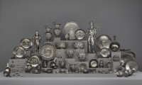
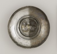
In 2014, the Getty Museum was fortunate enough to be allowed access to one of the world’s greatest Roman treasures: the silver hoard discovered by a farmer ploughing his field in Berthouville, Normandy, France, in 1830. An unprecendented assemblage of silver-gilt objects that epitomize the best Roman silversmithing had to offer, the plates, bowls, cups, pitchers, statuettes are crafted with high relief details, scenes from mythology and elaborate designs that were probably the dining set of an incredibly wealthy Roman. Inscriptions by the donor, one Quintus Domitius Tutus, dedicating them to the Gallo-Roman version of the god Mercury indicate they were later used for ritual purposes and deliberately buried, but first they were likely used to set a fabulously splendid banquet table.

Cup with Centaurs, 1–100 A.D. Cup with Centaurs, 1–100 A.D. Cup with Centaurs, 1–100 A.D.. gold det. Photo courtesy the JP Getty Museum.

The Getty Villa in Malibu played host to Berthouville’s most famous citizens starting in December 2010 as part of a collaboration with the Bibliothèque Nationale de France to employ its own greatest assets — the deep bench of conservation experience and know-how — to conserve and restore the objects. They had been roughly handled in the initial cleaning back in the olden days of the 19th century, so they needed cleaning, restoration and punctilious research to revive their shine. The work Getty conservators did uncovered a great deal of new information about how Roman silversmiths worked and how 19th century restorers worked.

Because of their aid in restoring these precious objects, the Getty was given the sole opportunity to exhibit the treasure and other fine silver pieces from the collection of the Cabinet des Médailles at the Bibliothèque Nationale de France. Ancient Luxury and the Roman Silver Treasure from Berthouville ran from November 2014 through August 2015. It was the first time the Berthouville treasure has ever been allowed to leave France and very possibly the last.

I wrote about the exhibition at the time, but I missed the very cool YouTube video showing how Roman silversmiths would have created one of the exquisite cups in the treasure. There’s also a cool 3D rotating view of the Mercury statuette that is one the stars of the Berthouville show.

The video quality on this one leaves something to be desired, but the content sure doesn’t. It’s a lecture by Getty antiquities curator Kenneth Lapatin on the background of the Berthouville Treasure.

Largest early world map stitched together virtually

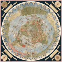
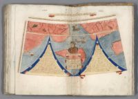
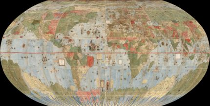
The largest known early map of the world has been digitally stitched together into one single glorious panorama of exotic far-flung lands and mythical creatures. This virtual parturition births into the world the cartographic baby of Urbano Monte, a 16th century geographer who created the planisphere in 1587. The 60-page manuscript covered depicted all the known world from the North Pole to the much conjecture but still unknown Terra Australis way down south. The 60 manuscript pages when put together to create the complete top-down view of the earth Monte envisioned are 10 feet by 10 feet, the largest early non-mural map known.

That’s not its only intriguing attribute. It’s a North Polar projection, aka an azimuthal equidistant projection which accurately positions landmasses along global meridians. While there are a few examples of the form before Monte’s planisphere, his use of the North Polar projection in this map was a major step forward and later cartographers borrowed from it liberally. He drew every part of the map by hand on those 60 sheets, labelling every land mass, every hill, every dale, every river, country, ship and coastline, practically every tree. There are charts that record the length of days and nights during the year, the strength of the sun’s rays at different times, a lunar eclipse, a wind chart and many tidy explanations of geographic nomenclature and concepts. It is unreal, and I’m not just saying that because of the mutant fish monsters and mermen living it up in the Terra Austraulis Ignonita, which appears to have basically been Vegas before Bugsy Siegal.

It was this information dense by design. Monte included information on weather, topographic data, the amount of daylight, and tons more because he wanted it to be the complete resource for the learned statesman, a scientific planisphere that was to be secured in a wood panel and revolve above the heads of viewers via a pin through the North Pole, a slowly turning planet, if you will. The revolving map was another innovation of Monte’s.

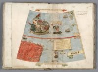
Unfortunately he never did put the manuscript sheets together and create his great masterpiece. The masterpiece has remained bound in Italian sheep leather for 430 years. (There are two other manuscripts known, one with missing areas, the other a later one of 64 pages.) Making Urbano Monte’s dream come true is now possible without destruction, as long as you have the expertise, resources and dedication to put in the many hours of work takes. The David Rumsey Map Collection at Stanford University recently acquired the manuscript and has been digitizing its pages. They’ve done a spectacular job and the end result is an online resource that allows visitors to zoom in to enormously high resolution images of each page as well as to see a digital composite of the pages in their proper order, assembled just the way Monte instructed on one of the pages of the planisphere. There’s a top-down view of the 10×10 square map, several reprojections that map the virtual map on to the globe, as a Mercator projection, etc. Every label is easily readable thanks to the zoom, resolution and Monte’s elegant, clear-as-a-bell handwriting. It’s a digital masterpiece of an analog masterpiece.

When we georeference Monte’s map and then re-project it into Mercator projection we immediately understand why he used the north polar projection instead of Mercator’s: Monte wanted to show the entire earth as close as possible to a three-dimensional sphere using a two-dimensional surface. His projection does just that, notwithstanding the distortions around the south pole. Those same distortions exist in the Mercator’s world map, and by their outsized prominence on Monte’s map they gave him a vast area to indulge in all the speculations about Antarctica that proliferated in geographical descriptions in the 16th century. While Mercator’s projection became standard in years to come due to its ability to accurately measure distance and bearing, Monte’s polar projection gave a better view of the relationships of the continents and oceans. In the 20th century air age, the polar projection returned as a favored way to show the earth. Monte would have been pleased to see a modern version of his map used in the official emblem of the United Nations.

That is totally cromulent map. Imaging making something even remotely that accurate with colored pencils and 60 sheets of paper (well, sheepskin). You must browse through every page of this map and zoom way in to the spot all the animals, monarchs on thrones, irate mermen, even the aritst himself in not one, but two self-portraits. It’s too good not to be enjoyed in all its glory. Then you can pay homage to the master by seeing it look incredible connected as he had intended it to be 430 years ago. It’s been a long time in coming.