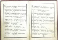
 In a post earlier this month about the Teschen Table, I waxed lyrical about the gorgeous handwriting of Carl Gottfried Nestler, the Dresden engraver who Johann-Christian Neuber commissioned to write the booklet that identified every mineral inlaid in the table top. “Someone needs to make a Nestler font,” said I, “because that handwriting deserves to be immortalized.”
As it happens, I knew of a someone who might just be able to accomplish such a noble feat. I have long been an admirer of the historical handwriting and typeface fonts created by Three Islands Press (3IP). When I finally get around to upgrading this site, 3IP fonts will feature prominently because they’re a) beautiful, b) meticulous and c) a history nerd’s ideal playground. On the off-chance that Mr. Nestler’s elegant hand might be of interest, I sent 3IP a message with a link to the Teschen Table story.
Much to my delight, 3IP founder and designer of my favorite fonts of all time Brian Willson answered me. He was intrigued by Nestler’s lettering, so much so that he envisions creating an organic hand and a complete text typeface from it. :boogie:
That project has to get in line, though, because Willson has other irons in the fire at the moment. Thankfully, he is extremely generous with his time and despite his insanely busy schedule, he agreed to sit for the second History Blog interview ever.
I told him that the first interview subject, the incomparable Janet Stephens, got famous a year after I posted her interview. Oh sure, it had nothing to do with me and everything to do with her particular genius at decoding the Vestal Virgin’s incredibly complex Seni Crines hairstyle, but that’s no reason not to brag that I was there before the Wall Street Journal. The entirely unrelated correlation of interview and fame proved no incentive anyway. As it turns out, his work is already famous the world over, if not by name then certainly by sight.
Q: How did you first get the idea to create fonts from historical handwriting?
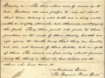 A: Back in 1994, when I was doing a little graphic design and desktop publishing on the side, I had occasion for some reason to use a font that looked like old handwriting, but I couldn’t find one anywhere. So I decided to create one. At the time, my mom — a historical librarian — worked at The Center for American History at the University of Texas, so I asked if she could send me copies of any old letters she might find lying around. Within a week or two, she’d sent me photocopies of a whole bunch of letters written by famous early Texans like Sam Houston, Mirabeau B Lamar, Emily Austin Perry, and Thomas J Rusk. Rusk’s handwriting seemed the most legible and least peculiar of the bunch, so I chose to work with that.
[Texas Hero was the result.]
Q: What was the first handwriting font you created and when was that?
A: The first handwriting font I created was also the first font I created — and it was not at all historical. The year was 1993. I was working either in the production or editorial department (I spent time in both) at a company that published trade magazines, and one of our art directors had some of the coolest hand-lettering I’d ever seen. I had by then experimented briefly with (then) Altsys Fontographer making logos and such and proposed turning her handwriting into a font. She agreed and drew out the alphabet on a piece of poster board. A few weeks (months?) later, I’d finished my first generation of the Marydale family. It’s what got me started in this whole wacky enterprise.
Q: Fonts were only a decade old in the early 90s, the province of computer manufacturers, software companies and visionary traditional typesetters like Monotype. Did you have any experience in graphic design or typesetting? How did you go from curiosity to execution? What tools did you use? How long did it take you to make the first one?
A: I had absolutely no training in typography at all. Up until then I’d worked mainly as a journalist — but that career had, by the mid- to late-1980s, put me in close proximity with early Apple Macintosh computers, and I couldn’t stop playing around most evenings with programs like Adobe Illustrator and (then) Aldus Pagemaker. Just fiddling. Exploring. Learning things. Soon I was offering to design newsletters for a couple of local non-profits I belonged to, and before I knew it I actually had some paying graphic design jobs.
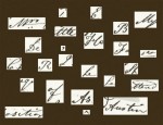
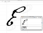
I’d guess it took me a couple hundred hours to make that first version of Marydale. I would scan each character very large, hand-trace it with Illustrator’s vector tools, import the outlines into Fontographer, and finish things up there. I didn’t know what the hell I was doing at first, but when you have a perfectionist streak you tend to keep banging away until you arrive at that “Voila!” moment. I had a bunch of those moments along the way, but I’m sure my font-making methods remain roundabout and inefficient. This all happened a year or two before the Web exploded on the scene, but I figured I’d release those first few fonts as shareware on CompuServe and America Online. I was pretty dang stunned — albeit pleasantly so — when checks started arriving in the mail. Which is pretty much all the incentive you need to keep going in a capitalist society like ours, ha ha.
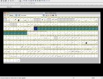
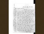 Over the years, as I’ve learned more about type design, I’ve repeatedly gone back and revised my early type designs — fixing inconsistencies, adding OpenType features, stuff like that. I now use FontLab Studio to create all my type.
Q: Did you think of it as a form of historical preservation from the beginning? Now that pen-to-paper writing has become increasingly rare as even the few remaining formal settings for handwriting like wedding invitations go virtual, has that added a sense of urgency to your work?
A: Not at first. I thought of it as: 1) a really cool, fun, sometimes tedious form of play; 2) a way to provide new and interesting resources for graphic designers. But I couldn’t help becoming immersed in the content of the source materials — Emily Perry’s letters home, Sam Houston’s “talks” to his Native American compadres — and I began to understand and empathize with the kind of urgent devotion to communication that went into putting pen to paper back then. Ironically, of course, this whole crazy pursuit of mine quite logically coincided with a modern decline in the art of handwriting. Heck, these days cursive is rarely even taught in school. I never saw it coming, but in the past few years it’s dawned on me that my type work truly is a kind of an odd form of historical preservation.
Q: Do you deliberately set out to look for good font candidates or do you mainly stumble on them in the course of doing other things?
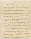 A: Stumble. I stumble around a lot. I wander, I ramble, I play. The first few fonts, especially, came from random moments of, “Hey, cool!” Once I started getting interested in the historical stuff, though, I have tended to keep an eye out for interesting source documents — Schooner Script is the result of an off-hand query I made to the owner of a local antique shop, and Broadsheet came from some old newspaper pages saved by a dealer of ancient longcase clocks. While on a trip to England several years ago, I came upon a business specializing in antique maps and ended up buying a page of an early-18th century Atlas: Antiquarian Scribe.
But I’ve also made fonts on a whim or at the suggestion of a customer. An example of the former is Viktorie, modeled after the barely legible scrawl of a waitress in a local restaurant; an example of the latter is Douglass Pen, after I had my interest piqued by an actor who had portrayed — and therefore knew a heck of a lot about — the famous American abolitionist and orator Frederick Douglass.
Q: What characteristics make for a good handwriting or historical typeface font?
A: I’m not sure I know that answer to that, at least not generally. I’d say a modicum of legibility, for one. But beyond that I suppose just an interesting sort of look or flourish or expressiveness that strikes you, that at once (if subliminally) makes you wonder at the character and personality of the person who took pen to paper (or set the type) in the first place. For some reason I’m reminded of my Bonsai font, an interpretation of a flawed, topheavy letterpress job. I’ve often wondered if the printers noticed the problem and maybe thought, “Meh, it’s legible enough.” (I, for one, think it’s lovely.)
Q: You make a point of explaining where the font came from in all your descriptions. How important is the backstory — the author of the hand, the source of the writing — to you?
A: Really important. Essential, to me — and, I think, to the folks who have licensed my fonts. I think humans generally have a keen curiosity about how things got the way they are and where things come from. Where we came from. Witness our interest in genealogy. Since we have fairly good memories, centuries of records at our fingertips, and brains that are prone to solving puzzles and imagining things, it’s no wonder that our thoughts turn to the preservation and illumination of the dim times that have gone before.
 Q: Do you have a favorite or favorites among the fonts you’ve made? What makes it/them stand out to you as particularly compelling?
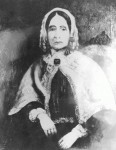
A: I think Lamar Pen is perhaps the best of my old handwriting fonts — at least the most elegant and handsome. (Note, though, that I am certainly not a fan of Mirabeau B Lamar, the second president of Texas, whose hand it simulates.) But I have a special fondness for Emily Austin. I believe this has a lot to do with the spirit of the woman herself, her expressiveness in her letters, how she wore her personality on her sleeve, so to speak, in the words and sentences she strung together. Emily was a product of her time, and her extant portraits show a strict and proper pioneer woman, but from all I’ve read she was a loving, thoughtful, motherly presence in the many lives she touched. Her descendants still celebrate her birthday every year down Texas way.
Q: I didn’t realize that you immersed yourself in your historical sources to the point of developing an understanding of their characters and lives, although from your description of Abigail Adams it’s clear you’ve read extensively enough to be able to discern different phases of her handwriting over the years. How thoroughly have you read the correspondence of Emily Austin, Frederick Douglass, Abigail Adams, Mirabeau Lamar and the other figures whose writing you have converted to fonts? Has there been a widely varying range of depth for each personage?
 A: I would say a fairly varied range. Ma sent me probably six or eight of Emily A Perry’s letters home from when she was traveling up East looking for a cure for her daughter’s spells and seizures. I had nearly that many of Lamar’s letters — and also a great reproduction of his journal on first traveling from Georgia to Texas in 1835.
I must confess: I didn’t read every page of that journal. Nor did I read all of Abigail Adams’s letters to John (or many of his to her) but rather found myself pausing every now and then while looking near at the shapes of letterforms and pulling back to find myself immersed in her words. Nor did I read every page of her son’s diary — which is no doubt a good thing, considering it spans some seventy years, because I’d probably still be reading!
 I probably read about a half dozen of Frederick Douglass’s letters and a number of his written lectures. And come to think of it, I believe I only had three or four of Rusk’s letters on which to base Texas Hero. This is the first time I’ve actually gone back and reviewed this measure. Kind of funny how it all worked out.
Q: You eloquently describe the experience of becoming engrossed by the source material. Primary sources taught in school history classes are often transcriptions rather than images of the original documents. Sometimes the writing is hard to decipher otherwise, but if we posit legibility, do you think it would help draw students in if they had to read letters/reports/news stories the way they were read in their time? That might help keep the dying art of penmanship alive too, since forgetting how to read it is part and parcel of forgetting how to write it.
A: I do certainly think it would help. There’s unquestionably more allure to original old — to a school kid, ancient — artifacts and documents than boring typeset transcriptions. In fact, I bet many kids would get a huge kick out of working to figure out how to decipher old handwriting. Trouble is, how many teachers would think it worth the bother? (It would so be worth the bother.)
Q: You’re read correspondence and diaries of notable figures, discovered obscure historical events like the dramatic destruction by water-and-quicklime fire of the Governor detailed in the letter that became Schooner Script, pored over antique maps, periodicals and rubbings of headstones. It seems to me that you’ve become a historian in the course of becoming a historical preservationist, all without remotely setting out to do it. Given how important the backstories are to you, have you considered writing more about them? I’m certain you have more than enough material for a fascinating book, a compendium of personal stories linked solely by great handwriting and texts.
 A: I’ve recently started an occasional blog about the vanishing art of penmanship, and I have so far tended to dwell on my historical adventures. I hadn’t really thought of a book, a compendium. You’ve piqued my interest!
Q: One of the aspects I love the most about your fonts is your inclusion of graphic elements like the ink blots of Remsen, the cartographic ornaments of Antiquarian and Terra Ignota and the printer’s flourishes of Broadsheet. Have you thought about using them as the kernels of complete, stand-alone historical icon sets? Because I am in a position to guarantee you at least one very keen customer.
 A: I sure enough have considered of this. A while back I even started work on an ink-blots-only font but then got sidetracked by somebody else’s handwriting. Pen-and-ink blots, antique cartographic ornaments, old printer’s flourishes — hm, it might just work!
Q: How is your own penmanship? Doctor scrawl, Palmer method roundness, John Hancock big, serial killer cramped? Would you ever make a font of your own hand?
A: I already have, so check for yourself!
[Spoiler: It’s called Cedar Street and it’s phenomenal. I heart the small caps so much I’d marry them.]
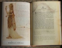 Brian kindly sent me images of his font-making process using Emily Austin as the example. One of the pictures was a page from Arthur Spiderwick’s Field Guide to the Fantastical World Around You which I realized with a start used Emily Austin in the chapter headings! This is when I finally understood that Brian Willson’s work was already crazy famous, so my boasting was as superfluous as it was unjustified.
I asked him how Emily had gotten such an illustrious gig; did he have a font agent or publicist or something? He replied:
I’ve never heard of a font agent or publicist, but that doesn’t mean they don’t exist. From nearly the beginning, though, I’ve stumbled on my fonts “in the wild” — used on book covers, signs, packaging, and whatnot. (Still seems highly implausible, but there you go.) With Arthur Spiderwick, someone bought a copy of Emily Austin on my website and, in the field on my checkout pages asking how people found us, mentioned that book by name. Turns out the publisher had listed the font name in the credits. (I have no idea where they bought it, but likely through one of my distributors.) I immediately ordered a copy, of course.
On my 3ipfonts.com site, there’s a “sightings” page where you can see a few examples. (I haven’t updated it in a while.)
Actually, many of my customers over the years have sent me photos or links showing my fonts in use. They’re really nice to do that.
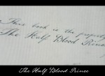 That sightings page is AMAZING. From a boat name in Penobscot Bay, Maine, to a package of crackers in Switzerland to the side of a U-Haul van, Brian Willson’s fonts are ubiquitous. They make appearances in blockbuster movies, best-selling books and chart-topping records too. That’s totally Lamar Pen playing the signature of the Half-Blood Prince in the sixth Harry Potter movie, and the “Dear John” on the cover of Nicholas Sparks’ eponymous novel is written in Schooner Script. Attic Antique is on the cover of Dave Matthews Band’s first studio album, Under the Table and Dreaming. Even Jimmy Kimmel got in on the action, using Texas Hero for his parody of Ken Burns.
It’s a testament to Brian Willson’s great selective eye and flawless execution that his historical handwriting and typeface fonts have spread so far and wide. I love to imagine what Emily Austin or Mirabeau Lamar would make of their writing starring in a Spiderwick Chronicles book and the Harry Potter and the Half-Blood Prince movie. Willson isn’t just preserving history by creating fonts from beautiful and unique period handwriting; he’s proving that great penmanship remains relevant in the era of keyboard dominance.