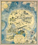
 Persuasive cartography is decidedly more the former than the latter. Its aim is to sell a product or influence opinion using the aesthetic allure and/or the impression of scientific rigor conveyed by maps. The actual science of mapmaking — accurate renditions of land masses, roads, structures, topographical features — isn’t the point, except insofar as it lends the cachet of objectivity to a pitch.
Retired lawyer PJ Mode began collecting maps after seeing an exhibition of old and unusual maps at the Centre Pompidou in Paris in 1980. Over the years he began to narrow his focus to maps of the persuasive persuasion, fascinated by the reasoning behind them. With the advent of the Internet, finding new cartographical gems and researching their background has become increasingly accessible. Today PJ Mode has more than 800 persuasive maps in his collection.
Last month, more than 500 of them were digitized by the Cornell University Library. Now there are 862 of them. They can be browsed by subject or date, you can just load the whole shebang and go through them front to back, or you can limit by date, date range, creator or subject from there. I’m partial to the subject divisions which convey a real sense of how far-reaching this medium was. Almost 200 of the maps are in the Advertising & Promotion category, and they are some of the most aesthetically interesting. The Niagara Belt Line uses one of the most spectacular views in the world to promote its electric trolley line.

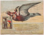 A good image can sell even the worst product, as any advertiser knows. Patent medicines, most of which were useless at best, active poisons at worst, needed all the colorful artwork they could get: see Peruvian Bitters, for example, which used a literal bird carrying an ad for the product over a bird’s-eye view of San Francisco to flog its bogus cure for malaria, dyspepsia, addiction and unhappiness.
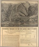 Even the plain ones without fancy graphics are intriguing because the dry presentation is often used to legitimize an extremely questionable proposition, like the Northern Pacific Railroad Gold Bonds or the Two Queens Mines in Australia, which was a straight-up scam.
The greatest number of maps, 349, are in the pictorial subject which covers an extraordinary amount of ground from military to political to moral advocacy. There’s even an edition of a map very similar to one I own in giant foldout poster form: a timeline of world history from a 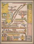 Biblically literal creationist perspective. Other subject categories you can browse include Alcohol, Heaven & Hell (schematics of Dante’s Inferno are always popular), Poverty, Prostitution, Crime, Slavery, Suffrage, Railroads, and lots and lots of wars.
All of the digitized maps are available for download in high resolution (the full Niagara view was so huge my server couldn’t even handle it, and my server is used to the strain, believe me), or if you prefer, can be zoomed in extreme closeup on the Cornell site itself. Fair warning: this is a timesink of gloriously massive proportions. The 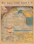 information on each entry was written by PJ Mode himself based on his research. He makes no claim to flawless understanding, so if you find something you think might be inaccurate, you’re encouraged to click on the “Contact” link at the bottom of the page and let folks know.
Speaking of which, the following video is 50 minutes long, but it’s so worth it. It’s a talk PJ Mode delivered last year to The Grolier Club and the New York Map Society about persuasive cartography. Unlike most lecture videos, the people doing the talking only appear rarely. The vast majority of the presentation is of the maps being projected. I can’t tell you how many times I’ve been irritated by the neglect of the visual aids in recordings of these types of events. Whoever filmed this talk deserves an award. Be sure to watch it full screen so you can see the small details of the map as large as possible.